Browsed by
Author: Ben

Export Fabric notebook to PDF

Export Fabric notebook to PDF

As of now exporting Fabric notebook to PDF is not directly supported so here is a simple workaround to export Fabric notebook to PDF. Export Fabric notebook to PDF: Alternatively, you can export the notebook as a .ipynb file and open it using Anaconda. From Anaconda, you should be able to export the notebook as a PDF, assuming you have installed the necessary packages, such as mkteverx.

Export the results of best practice analyzer from all models

Export the results of best practice analyzer from all models

In this post, we will see how to automatically export the results of best practice analyzer for all our models. This post focuses on SQL Server Analysis, Azure Analysis Services, and Power BI datasets only if you have access to the BIM files. To automatically export the results of best practice analyzer from the Power BI service requires different approaches, especially on the authentication side which I won’t cover in this post. What is Best Practice Analyzer Best Practice Analyzer…

Read More Read More

Migrate SSAS to Power BI Premium

Migrate SSAS to Power BI Premium

In this post, we will cover how to migrate SSAS to Power BI Premium using Tabular Editor. While there may be some more advanced techniques using scripting to Migrate SSAS to Power BI Premium this post focuses on a simple solution which is probably just fine for most small to medium-sized companies. Why migrate SSAS to PowerBI Premium instead of Fabric? Why Migrate SSAS to Power BI Premium instead of opting for Fabric? Well, surely migrating an on-premise architecture to…

Read More Read More

Pagination in Fabric Notebook Using Fabric Rest API

Pagination in Fabric Notebook Using Fabric Rest API

In this post, we will see how to perform pagination when calling Fabric Rest API from a notebook. Note that at the time of writing this post the Fabric REST API is still in preview. What is pagination Pagination is a process used to divide a large dataset into smaller chunks and each smaller chunk contains a pointer to the next smaller chunk until there’s no more chunk. As Fabric REST API limits the number of records it returns it also…

Read More Read More

Generate Large Sample Data in Fabric

Generate Large Sample Data in Fabric

In this post, we will explore how to generate large sample data in Fabric. Why do we need to Generate Large Sample Data in Fabric? I can think of many many reasons to generate large sample data in Fabric but one of the reasons I see as crucial is for testing performance or to help us decide which tier we should buy for now or in the future. Today, Fabric offers built-in sample datasets, but they may not suffice for…

Read More Read More

DAX measure Top N ranking with drill down

DAX measure Top N ranking with drill down

In this short post, we will explore how to create a DAX measure for Top N ranking with drill down. Purpose of this DAX Measure In many business scenarios, understanding the performance of products at different levels of a hierarchy (such as Category, SubCategory, and Product) is crucial. The ‘Top N Ranking with Drill Down’ measure in DAX allows users to dynamically rank products at each level of this hierarchy based on their sales performance. This dynamic capability means that…

Read More Read More

Load data from Synapse to Fabric

Load data from Synapse to Fabric

In this short post, we will cover how to load data from Synapse to Fabric or from Azure Data Factory using Sznapse/ADF pipelines. Note that at the time of writing this post the feature to load data from Synapse to Fabric is still in preview.Note that loading data from Synapse to Fabric using Synapse notebooks was already feasible, but these notebooks don’t natively support connections to on-premise SQL databases. Why loading data from Synapse to Fabric In the best world,…

Read More Read More

Enable measure suggestions with Copilot in Power BI

Enable measure suggestions with Copilot in Power BI

In this short post, we’ll explore how to enable quick-measure suggestions using Copilot in Power BI. Quick measure feature in Power BI If you’re not already aware, Power BI has a feature called quick measure that allows you to simply drag and drop columns to generate predefined measures such as time intelligence, Top N, aggregate measures, etc… Another available feature was the Suggestions where you could simply use natural language to ask Power BI to generate the DAX code for…

Read More Read More

Fabric is it really new?

Fabric is it really new?

Following Microsoft’s recent unveiling of Fabric, a ton of videos have flooded the internet, making it hard to keep pace, and even though I was part of the private preview I wanted to take some time to digest all the information before sharing my first thought about Fabric’s new release. While there are already plenty of blogs or tutorials about Fabric I also noticed that there were some claims about Fabric just being a rebranding or just a new way…

Read More Read More

Arithmetic Mean vs. Geometric Mean in Power BI

Arithmetic Mean vs. Geometric Mean in Power BI

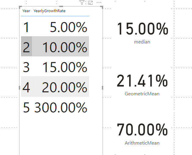
In this blog post, we will explore the difference between the Arithmetic Mean and the Geometric Mean with some practical examples in Power BI using the built-in DAX function geomean. Arithmetic Mean The arithmetic mean, also known simply as the “mean” or “average,” is the most common measure of central tendency. It is calculated by summing all the values in a data set and then dividing by the number of values. In DAX, you can use the AVERAGE function to…

Read More Read More

One Hot Encoding in Power BI

One Hot Encoding in Power BI

In a recent post where I described how to implement multiple linear regression in Power BI, I had to perform one hot encoding to make my categorical variable usable by the model. So I decided to make another short post to explain what is hot encoding and how to implement it in Power BI using Power Query. Why do need to perform Hot Encoding? In machine learning or statistical algorithms, many models require to have only numerical input variables. So…

Read More Read More

Multiple Linear Regression in Power BI

Multiple Linear Regression in Power BI

In this post, I will describe how to implement Multiple Linear Regression in Power BI using DAX only. In the February 2023 release, Power BI introduced a new function called “Linest“, so we will see how to use it to make predictions and interpret its result. Linear Regression Linear regression is a type of statistical analysis used to find the relationship between two variables. It is used to determine how one variable (dependent variable) is related to another variable (independent…

Read More Read More

Incrementally load data from SQL database to azure data lake using synapse

Incrementally load data from SQL database to azure data lake using synapse

In this post, we will cover how to create a simple and fully dynamic synapse pipeline to incrementally load data from an SQL database to parquet files stored in a data lake. Why should we move data from a database to a data lake In the traditional data warehouse approach, it is very common to move all the data sources and historize them into an ODS database.However, moving and storing data from all the data sources into a single database…

Read More Read More

Time to be mentored

Time to be mentored

Recently Paul Rendal has offered one more to mentor people in 2023. Nikola Ilic also mentioned that he was Paul’s mentee in 2020. Today Nikola is by far one of the top bloggers around Power BI and if he’s there today it is of course because of his expertise, hard work, and dedication to the community and also as he’s said himself because he had mentors to help him grow and Paul Rendal was one of them! So let’s talk…

Read More Read More

Reduce disk space used by Power BI Desktop

Reduce disk space used by Power BI Desktop

If like your C drive was running out of space and you decided to free up some space you may have realized that Power BI desktop was using a lot of your disk space. In this short post, we will see why Power BI desktop is consuming a lot of disk space and how we can safely reduce it. Analyze disk space usage There are multiple ways to analyze the disk usage space, we can use the built-in windows tool…

Read More Read More

Optimized median measure in Dax

Optimized median measure in Dax

In this post, I describe how to write an optimized median measure in Dax which under specific criteria can be 1,000 times faster than the built-in median function.Some time ago I was tasked to migrate a multidimensional cube to a tabular model, this cube had around 2 billion rows and I also had to create a median measure on the new tabular model. I first thought that the median would be much faster to calculate on a tabular model than on…

Read More Read More

Analysis services 2022 new features deep dive part 1: Composite Model and DAX

Analysis services 2022 new features deep dive part 1: Composite Model and DAX

Since the release of Analysis services 2022 I never took the chance to explore its new features and improvements so in this post I will deep dive into each new and updated feature. The public preview of SQL Server Analysis Services 2022 was released on May 2022 and at the time of writing this post, SSAS 2022 is still in public preview. Analysis Services 2022: Why don’t we just migrate to Azure AS or PBI premium? One might ask if…

Read More Read More

Chi-square test in Power BI

Chi-square test in Power BI

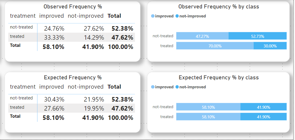
In this post, we will see how we can implement the Chi-square test in Power BI using DAX only.There are three main types of chi-square tests but in this post, we will focus only on the chi-square test for independence. What is Chi-square? A chi-square test for independence compares two variables (which can hold multiple values) in a contingency table to see if there is a relationship between each other. In other words, it tests to see whether distributions of categorical variables differ from each other. Another…

Read More Read More

How to perform pagination in azure data factory using Rest API

How to perform pagination in azure data factory using Rest API

REST APIs typically have some mechanism to transmit large volumes of records broken up into pages of results. In this post, I describe how to perform pagination in azure data factory or Synapse pipeline using the Azure REST API. What is pagination Azure REST API limits the number of items it returns per result, so when the results are too large to be returned in one response we need need to make multiple calls to the rest API. So when the results…

Read More Read More

Show text results from an R visual in Power BI

Show text results from an R visual in Power BI

In this short post, I will describe how to show text results from an R script visual in Power BI. Microsoft Idea Today there is already an idea submitted to Microsoft to enable this possibility however this idea does not have a lot of votes so it is not likely to be added anytime soon so then the workaround comes to the rescue! Why do we even need to show text result from an R visual? According to the multiple…

Read More Read More

Paired T-test in Power BI using DAX

Paired T-test in Power BI using DAX

In this post, I will describe how we can implement a paired t-test in Power BI using DAX only. What is T-Test A t-test is a type of inferential statistic that can be used to determine if the means of two groups of data are significantly different from each other. In other words, it tells us if the differences in means could have happened by chance. There are three types of t-test: An Independent Samples t-test compares the means for two groups. A Paired sample t-test compares means from…

Read More Read More

Hide tables in Power BI

Hide tables in Power BI

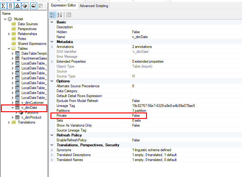
It is possible to hide tables in Power BI by using the “Hide in report view” option, however, if a user downloads the PBIX file this is still possible to view hidden tables or to unhide tables and this is also true for the reports with a live connection to SSAS or PBI dataset. In this post, I’m going to show another way to hide tables in Power BI which prevents users or anyone to view the hidden tables. Hide…

Read More Read More

Retrieve the MDX queries generated by Excel

Retrieve the MDX queries generated by Excel

When we use Excel to interact with an SSAS tabular model or a Power BI dataset via Analyze in Excel, Excel generates MDX queries which are then sent to the SSAS engine.So whenever a user is complaining about a pivot table connected to an SSAS or PBI dataset being too slow or showing wrong figures we may need to retrieve the MDX queries generated by Excel to investigate the issue. There are several ways to retrieve the MDX queries generated…

Read More Read More

Univariate Statistics DAX Cheatsheet

Univariate Statistics DAX Cheatsheet

In this small post, I’m sharing and will keep up to date the list of the most common univariate statistics DAX functions available in Power BI, as of now most of them are built-in functions but the more complex ones still require writing some Dax code. I’m sharing this through a Power Bi app where we can simply copy/paste the DAX code of the selected function. The Power BI

Correlation Coefficient in Power BI using DAX

Correlation Coefficient in Power BI using DAX

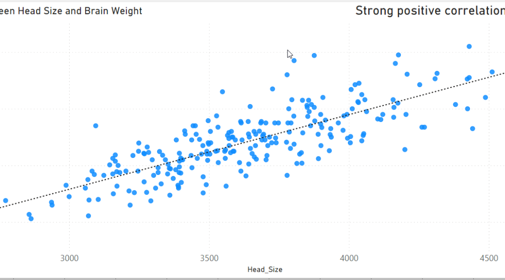
In this post, I will describe what is the Pearson correlation coefficient and how to implement it in Power BI using DAX. What is the Correlation Coefficient The correlation coefficient is a statistical measure of the relationship between two variables; the values range between -1 and 1. A correlation of -1 shows a perfect negative correlation, and a correlation of 1 shows a perfect positive correlation. A correlation of 0.0 shows no linear relationship between the movement of the two variables. How…

Read More Read More

Poisson Distribution in Power BI with DAX

Poisson Distribution in Power BI with DAX

In statistics, a Poisson distribution is a probability distribution that is used to show how many times an event is likely to occur in a fixed interval of time or space. In other words, it is the distribution for the counts of events that occur randomly in a given interval of time. It was named after French mathematician Siméon Denis Poisson. In this post, I’m going to describe how to implement the Poisson Distribution in Power BI with DAX. The Poisson distribution can be applied…

Read More Read More

Skewness and Kurtosis in Power BI with DAX

Skewness and Kurtosis in Power BI with DAX

In this post, I will describe what Skewness and Kurtosis are, where to use them and how to write their formula in DAX. What is Skewness Skewness is a measure of symmetry, or more precisely, the lack of symmetry. A distribution, or data set, is symmetric if it looks the same to the left and right of the centre point. For a unimodal (one mode only) distribution, negative skew commonly indicates that the tail is on the left side of the distribution, and positive skew…

Read More Read More

Performance Benefits of Partitioning in Analysis Services Tabular

Performance Benefits of Partitioning in Analysis Services Tabular

I previously wrote a post on how to dynamically partitioning tables in SSAS tabular using SQL, but in this short post, I will focus on the performance side of partitioning. What is Partition Partitions split a table into logical partition objects. Each partition contains a portion of the data, partitions can be processed in parallel independent of other partitions or excluded from processing operations if they don’t need to be refreshed. Why partitioning improves the refresh performance The main reason…

Read More Read More

Dynamically partitioning tables in SSAS Tabular model using SQL

Dynamically partitioning tables in SSAS Tabular model using SQL

In this post, I describe how we can dynamically partitioning tables in SSAS tabular using SQL.This approach works well for most of the simple scenarios where we need to keep control over the number of partitions to refresh daily or any frequencies. What is partition Partitions split a table into logical partition objects. Each partition contains a portion of the data, partitions can be processed in parallel independent of other partitions or excluded from processing operations if they don’t need…

Read More Read More

Clustering in Power BI using R

Clustering in Power BI using R

Since 2016 there’s a built-in feature in Power BI that allows us to automatically find clusters within our data.This is a great feature, however, its main drawback is that whenever we add new data into Power BI the clusters need to be manually recalculated for the new data. In this post, I will show how we can implement clustering in Power BI using R and automatically recalculate the clusters whenever we hit the refresh button. What is Clustering Clustering is the…

Read More Read More

Data Dictionary Using DMV Queries

Data Dictionary Using DMV Queries

In this short post, I show how we can integrate a data dictionary using DMV queries within an SSAS tabular model and why we should do so. Why should we have a Data Dictionary within our model? The more complex a model becomes the more documentation we need to have about it. The more measures and complex formulas we have in a model the more calls/questions we have from end-users and thus the less time we can spend on getting…

Read More Read More

R – Power BI – Add target marker for each bar in a Grouped Bar Chart

R – Power BI – Add target marker for each bar in a Grouped Bar Chart

As of now, in the Power BI Line and Clustered Column chart, we cannot Combine Clustered Columns with Clustered Lines or Markers.

In Power BI the markers all line up over the middle of the cluster instead of overlaying every single column.

So in this short post I share how to create such a visual using R.

AB Testing with Power BI

AB Testing with Power BI

A/B testing, or split testing, is a digital marketing technique that involves comparing two versions of a web page or application to see which performs better.

In this post, I am going to share a step by step guide to implement AB Testing with Power BI.

Power BI Dynamic visuals using Python in 1 minute

Power BI Dynamic visuals using Python in 1 minute

By now there’s plenty of good tutorials that explain how to create your own visualisations in Power BI by using R or Python like the Microsft one here.However, I haven’t seen any articles on how to create dynamic visuals by using Python (or R).So in this post, I’m going to show a very simple and fast way to create your power bi visuals by using python. (Same can be done using R) Goals of this Post Create visuals by using…

Read More Read More

SSAS/Power BI – Take Calculation Groups to the next level with Tabular Editor

SSAS/Power BI – Take Calculation Groups to the next level with Tabular Editor

Now it’s been a year since the game-changer new calculation groups feature has been released and I just thought that I still haven’t written a post on it. Goals of this Post Use Calculation Groups Use Tabular Editor Advanced Scripting Speed up SSAS/PowerBI model development Create reusbale script Setting up the Environment Power BI: Download here. Tabular Editor: Download here. SQL Server 2019 and later Analysis Services or Azure Analysis Services. At the time of writing this post, Calculation Group…

Read More Read More

Calculation Group in Power BI – Error: Time Calculation Requires selection of exactly one calculation item.

Calculation Group in Power BI – Error: Time Calculation Requires selection of exactly one calculation item.

I first thought that the recent calculation group feature wasn’t working in a matrix when selecting more than one calculation item from a slicer, until, I realised that all I had to do to fix it was to simply disable the “column subtotals” option. To be honest I find the error message shown by PBI misleading. So if you encounter the error”Time Calculation Requires selection of exactly one calculation item” here is what you have to do to fix it:…

Read More Read More

Dynamic format strings for currency conversion in PowerBi with DAX

Dynamic format strings for currency conversion in PowerBi with DAX

I’ve previously written an article on how to dynamically convert and change the currency of a measure using a slicer.Now let’s see how we can use dynamic format strings for currency conversion in PowerBi with DAX. Model Prerequisite Add the FormatString column into your currency dimension You can download the file with the sample format string from here.Make sure to use a Unicode type column to store the different format strings otherwise the collation of your DB might not support…

Read More Read More

Create interactive R custom visual in Power BI

Create interactive R custom visual in Power BI

In this short post we will see how can step by step create an interactive R custom visual in Power BI Prerequisites Install node.js: Download and Install the latest version of node.js from  the node.js website Install R : Download and install the latest version of R from here.Once R is installed I also recommend you to install R Studio the integrated development environment for R.  Enable R scripting in Power BI: In Power BI desktop, go to File >…

Read More Read More

DAX – TREATAS function – Book-to-Bill Ratio use case

DAX – TREATAS function – Book-to-Bill Ratio use case

Treatas is a powerful DAX function that applies the result of a table expression as filters to columns from an unrelated table. In other words, treatas applies the filter context of a specific table to another unrelated table (no relationship in the model). Book to Bill ratio A book-to-bill ratio is the ratio of orders received vs orders shipped and billed for a specific period, a month in our case. The book-to-bill ratio reveals how quickly a business fulfils the demand for…

Read More Read More

Power BI Exclude data based on Slicer selection

Power BI Exclude data based on Slicer selection

In Power BI the slicers allow us to filter and view only the information that we want but we can also in Power BI Exclude data based on Slicer selection. In this short post, I will show how we can reverse the behaviour of a slicer “excluding” the selected values instead of “filtering” the selected values. What is a Power BI Slicer? In Power BI a Slicer is a canvas visual that allows us user to filter and view only…

Read More Read More

Visual level filters for slicers

Visual level filters for slicers

Since the latest Power BI release (June 2019) we are now able to filter a slicer based on a measure!And I think we’ve all been waiting for this feature for quite a while. One of the top reason we needed this feature was to have the ability to sync slicers. (Well this was already achievable with the bidirectionnel filter which is a really bad practice…) So as we can see on the example below the customer Alma has bought only…

Read More Read More

Ho to set up Jupyter notebook default folder in Anaconda

Ho to set up Jupyter notebook default folder in Anaconda

I have two laptops with Anaconda installed on both and I had some issues to find a working solution to configure the start in folder of Jupyther so I though it’d be a good idea to post the two solutions that worked for me. Using PowerShell command Open the windows powershell prompt or the powershell Anaconda prompt and type the following: This will generate a file to your user default directory: C:\Users\username\.jupyter\jupyter_notebook_config.py Then open this file in any Editor and…

Read More Read More

Visualising Deviation From Average in Power BI

Visualising Deviation From Average in Power BI

In this post, I illustrate how to implement Deviation From Average in Power BI and why we should use it. Margin is a key metric to assess high-level performance of a company. But sometimes we want to measure and compare specific shop or department or employee performance with the entire company overall performance and this where deviation from average metric comes to help. The requirement are as follows: Company overall margin over time (which is just the margin average) Employee…

Read More Read More

DAX Time Intelligent – Single Measure For Multiple Dates

DAX Time Intelligent – Single Measure For Multiple Dates

Let’s assume a scenario where we have 50 time intelligent measures and 5 dimension Dates (order, invoice, ship, due, calendar…). If we want the 50 measure to interact with the 5 dimensions we would need to create 250 measures which might rapidly overwhelm the users as they must sift though so many measures. This script below allows you to drag any dates with the YTD margin measure and the measure will dynamically apply the calculation accordingly and thus keeps our…

Read More Read More

SSRS Multi-Value parameter using DAX

SSRS Multi-Value parameter using DAX

In this post, we will how to set up multi-value parameters in SSRS using DAX. Setting up Multi-Value Parameter using DAX in SSRS with 3 steps For those who are already familiar with SSRS using MDX, it’ll be pretty straightforward as this is exactly the same logic, only the syntax changes and of course the language. In this post, I’m using the AdventureWorks Tabular model database which you can download here 1. Multi-Value Parameter We first need to create a…

Read More Read More

How to change the size of Plot Figure Matplotlib

How to change the size of Plot Figure Matplotlib

  When plotting figures with matplotlib you might want to change the size of the figure displayed. So here is a quick trick to adjust the size import matplotlib.pyplot as plt #Inside your plot code just type the following line of code #Set the plot width to 12 inches and height to 6 inches plt.rcParams[“figure.figsize”] = [12,6]  For more details see the  figure  documentation .