Visualising Deviation From Average in Power BI
In this post, I illustrate how to implement Deviation From Average in Power BI and why we should use it.
Margin is a key metric to assess high-level performance of a company.
But sometimes we want to measure and compare specific shop or department or employee performance with the entire company overall performance and this where deviation from average metric comes to help.
Table of Contents
The requirement are as follows:
- Company overall margin over time (which is just the margin average)
- Employee margin over time
- Employee margin deviation from the company margin average over time
- Employee margin deviation vs Last Year Employee margin deviation
And the final result should look like this:

Now let’s define our measures:
Margin and Overall Margin calculation
Margin:
Margin % = divide(([Total Revenue]-[Total COGS]),[Total COGS])Overall Margin:
All Margin = if( ISBLANK([Margin %]), BLANK(), calculate([Margin %],ALLEXCEPT('Fact','Date')) )Removes all context filters except filters that have been applied to the fact or date tables.
Margin Deviation From Average measures
Margin Deviation From AVG:
Margin Deviation = var _AllMargin = calculate([Margin %],ALLEXCEPT('Fact','Date')) Return IF(ISBLANK([Margin %]), BLANK(), [Margin %] - _AllMargin )Margin Deviation CY vs LY (Hidden):
Margin Deviation CY vs LY (hidden)= var _MarginDeviationLY = CALCULATE([Margin Deviation], SAMEPERIODLASTYEAR('Date'[Date]) ) var _MarginDeviationCYvsLY = [Margin Deviation] - _MarginDeviationLY Return IF(ISBLANK(_MarginDeviationLY), BLANK(), IF(_MarginDeviationCYvsLY>0, 1, 0 ) )Margin Deviation CY vs LY:
Margin Deviation CY vs LY = IF(ISBLANK([Margin Deviation CY vs LY (hidden)]), BLANK(), IF([Margin Deviation CY vs LY (hidden)>0, UNICHAR(9650), UNICHAR(9660) ) )Unichar is a great function which returns the Unicode character referenced by the numeric value, we can draw really cool stuff with this function.
(UNICHAR(9650) Up-Arrow, UNICHAR(9660) Down-Arrow)
Visualising everything together
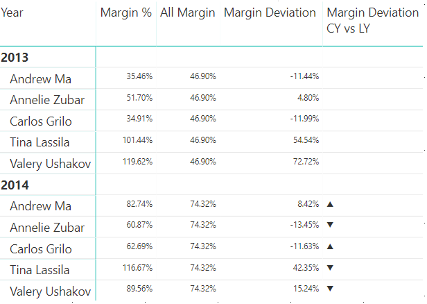
Now let’s put together our measures into a matrix visual:
- Margin %: Margin by employee and by year
- All Margin: Yearly margin of the entire company
- Margin Deviation: This is simply the difference between the employee margin and the average margin of the entire company
- Margin Deviation CY vs LY: Current Year Margin Deviation versus Last Year Margin Deviation

How do we read this result:
Andrew Ma:
In 2013 the entire company margin AVG was 46.9% and Andrew margin was 35.46% hence below the AVG margin by -11.46%.
In 2014 the AVG margin is 74.32% and Andrew has now performed better than the AVG margin by 8.42%.
Note that Andrew has also increased his margin Deviation by nearly 20% (8.42–11.44) so he got an up arrow.
Tina Lassila:
In 2013 Tina realised a Margin% of 101.44% and she beat the AVG margin by 54.54%.
In 2014 Tina realised a Margin% of 116.67% which is a nice increase compared to 2013!
However, it turns out that the whole company performed better in 2014…
So if we look at Tina’s Margin Deviation compared to the last year we notice that she did not perform as good as in 2013 and thus got a down arrow.
A nicer visual

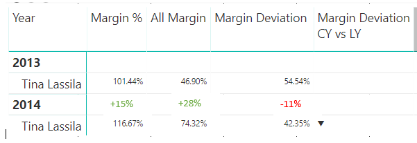
To get this visual we just need to keep the previous matrix above, remove the first two columns and then apply some conditional formatting using the Margin Deviation CY vs LY (hidden) measure.
And by looking at this visual we can clearly observe that Tina performance compare to the AVG Margin has decreased by around 10%.

In most cases, the margin indicator is used to assess people, team or product performance.
However, by using the Margin only we’re missing out on the overall trend of the company. At first sight, an increase of 15% seems great but once we realise that the overall increase was actually 28% it doesn’t seem great anymore.
This is why the deviation from average can provide really great insight from our data but using it alone could also be misleading as even if Tina Margin Deviation is not that good she’s still the best performer for the year of 2014.
So I think combining the Margin% and Margin Deviation from average measures together is always a good idea!
Here is the Power BI Customer Profitability sample that I used for this article.
Note that throughout this article I have used the margin measure to illustrate the deviation from average application but the same pattern can be applied to any measures like Sales volume, Delivery time, Profit, etc…
2 thoughts on “Visualising Deviation From Average in Power BI”
Thank you, good example for my use case!
Hi Suzan,
You’re welcome and thanks for your comment!